









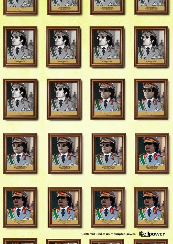
What happens when an advertisement makes its strongest argument without showing the product? In ICellpower’s Uninterrupted Power campaign, political history becomes the unlikely language of electricity advertising. Developed by Insight Publicis in Nigeria in 2020, with Toheeb Popoola as art director, the campaign features repeated portraits of Robert Mugabe and Muammar Gaddafi, each accompanied by a year. Beneath the images, a restrained line delivers the proposition: “A different kind of uninterrupted power.” The concept is provocative, but its real achievement lies in how the design makes an abstract idea immediately visible.
Where conventional electricity advertising might depict generators, illuminated homes or the inconvenience of outages, this campaign uses repetition as its principal communication device. Portraits arranged in four rigid columns create the impression of an official gallery whose occupants never change. The wooden frames, brass-coloured nameplates and measured spacing suggest authority and permanence. Yet the longer the viewer studies the arrangement, the more absurd that permanence becomes. Popoola’s art direction turns a straightforward grid into a visual argument about the persistence of power.
The execution demonstrates a disciplined understanding of composition. Every portrait occupies a defined position, producing a rhythm that encourages the eye to move across and down the page. The consistency is deliberate. Without it, the repeated images might appear as a collection of historical photographs rather than a single creative statement. By controlling their scale, framing and placement, the design allows the absence of change to become its most conspicuous feature.
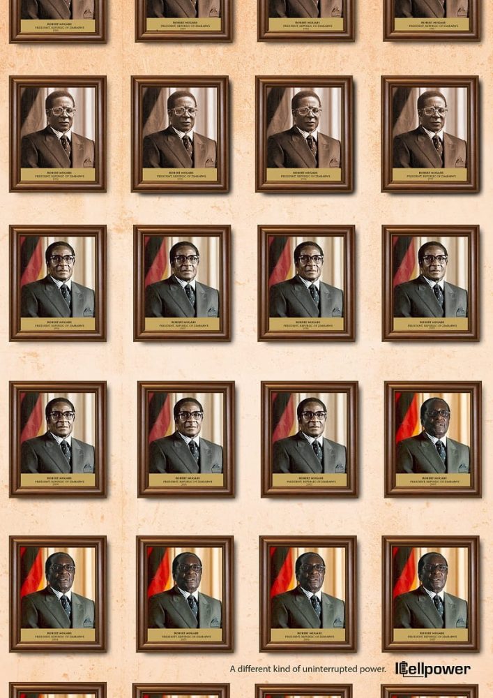
There is also intelligence in the treatment of colour. The Mugabe execution uses a warm, weathered background, while the Gaddafi version introduces a pale yellow-green surface. Within both arrangements, changes in photographic tone and saturation interrupt the otherwise repetitive structure. These variations create visual evidence of passing time without disturbing the central composition. Popoola demonstrates how subtle differences within a controlled arrangement can communicate more effectively than additional imagery.
The relationship between image and copy is equally considered. The portraits establish the premise long before the words explain it. When the viewer reaches the closing line, the meaning of the entire composition changes. Political longevity becomes a metaphor for electrical continuity. This delayed reveal is an accomplished piece of advertising design because the visual material and written message depend on each other. Remove the portraits and the line becomes an ordinary product claim. Remove the line and the work becomes political commentary.
Yet the technique introduces a weakness in visual hierarchy. The portraits dominate almost the entire composition, leaving the ICellpower identity and tagline relatively small at the bottom. Their restrained placement protects the joke from premature explanation, but it also reduces the brand’s immediate visibility. In a magazine, where readers may spend time examining an image, that decision is defensible. On an outdoor poster encountered briefly, the audience could recognise the political reference without ever registering the advertiser.
The campaign also asks considerable effort of its viewers. Its effectiveness depends on recognising the figures, understanding their prolonged rule and making the connection to uninterrupted electricity. The repetition supplies a strong visual clue, but the historical knowledge required to complete the joke is not universal. What appears immediately intelligent to one audience may remain an unexplained sequence of portraits to another. The design gains cultural specificity at the expense of broader accessibility.
More controversially, the work compresses complex political histories into a single humorous comparison. Mugabe and Gaddafi represent periods of rule associated with repression and human suffering. Their longevity becomes the mechanism through which the electricity brand communicates reliability. The comparison is memorable precisely because it is uncomfortable. The question is whether the creative impact justifies reducing those histories to a convenient advertising device.
This tension makes the art direction worth examining rather than dismissing. Political references are not inherently unsuitable for commercial communication. Their effectiveness depends on whether the creative treatment contributes meaning beyond recognition. Here, the repeated frames do more than invoke controversial figures. They transform duration into a visible pattern, allowing viewers to experience the central idea through the composition itself.
Popoola’s contribution should also be understood within the collaborative nature of the campaign. Working alongside creative director Chuka Anthony Obi and copywriter Ifeanyi Dibia, he helped translate a verbal proposition into a visual structure capable of carrying its own argument. The strength of his art direction lies in making repetition expressive, controlling the pace of discovery and resisting unnecessary explanatory elements.
Uninterrupted Power is an accomplished example of concept-led advertising design, distinguished by its compositional discipline and economy of visual storytelling. Its weaknesses are equally clear: the brand risks disappearing behind the metaphor, and the cultural reference carries historical weight that the advertisement cannot fully address. Popoola’s work succeeds in making permanence visible. Its unresolved challenge is ensuring that the history used to communicate a product promise does not become more significant than the promise itself.
Written by: Peter Sunday